WRITING Task 1 - Practice Questions
US Employment Numbers
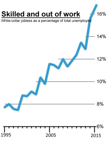
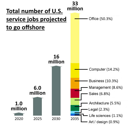
The line graph below shows the percentage of unemployed U.S 'white collar' (i.e. office or professional) workers between 1995 and 2015, expressed as a percentage of the total U.S unemployment figures. The bar graph shows the number of U.S service industry jobs that are expected to 'disappear' abroad to other countries from 2020 to 2035. Summarise the information by selecting and reporting the main features and make comparisons where relevant.
You should write around 150 words. You are advised to spend no more than 20 minutes on this task.
Tips
- It is a good idea to structure your answer into an introduction, main paragraphs and conclusion. In this way, 150 words breaks down into 3 or 4 paragraphs.
- Check your answer describes the charts accurately and indicates the main trends.
- If your answer ends up too long, cut out detailed statistics and/or descriptions.
- Don't give any subjective opinions or try to extrapolate from the information.
- Use a variety of sentence structures and vocabulary to describe the graph
Possible Answer for Practice Question 1
The line graph below shows the percentage of unemployed U.S 'white collar' (i.e. office or professional) workers between 1995 and 2015, expressed as a percentage the total U.S unemployment figures. The bar graph shows the number of U.S service industry jobs that are expected to 'disappear' abroad to other countries from 2020 to 2035. Summarise the information by selecting and reporting the main features and make comparisons where relevant.
From the line graph, it can be seen that the percentage of unemployed U.S white collar workers has risen steadily over the last 20 years, with a few decreases that proved to be temporary. In fact, white collar unemployment has more than doubled, from just under 8% in 1995 to over 16% in 2015.
The bar chart shows the number of jobs expected to be contracted outside of the U.S between 2020 and 2035. Figures are projected to increase sharply over time: 1 million in 2020 rising to 6 million in 2025. Another 10 million are anticipated to go by 2030 and this 16 million total is expected to more than double to 33 million by 2015. Around half the jobs will probably be office posts, one in six in computers and a tenth in business: the remaining quarter include management, sales, architecture, legal, science and arts posts.
It is predicted that the trend of disappearing jobs is likely to continue as work is contracted 'offshore'. Most of the jobs lost will probably be office posts.
176 words
Comments:
This is a good answer, and can be used as a model. It does not adhere to the 'intro/main/conclusion' formula suggested in the 'Tips' section, but instead takes each graph in turn and describes the information given. The length is appropriate. A summary is given at the end.
NB: It uses the present perfect tense to talk about the time period up to the present, the present tense to describe the graphs themselves. ‘Projected’, anticipated', ‘expected’, and ‘will probably’ are used to describe the future.
NB: It describes the main trend in the line graph ('more than doubled'), and the starting and finishing figures (>8% and <16%) only.
NB: It interprets the breakdown of the 33 million professional posts in the bar chart in fractional terms a) to demonstrate an ability to understand and interpret figures without giving a personal viewpoint, & b) because they break down quite neatly.