WRITING Task 1
Task Description
Task 1 (of 2) is a short piece of writing (around 150 words) describing data or information given on the question paper. This information can be in the form of graphs (bar or line), pie charts, tables, maps or process diagrams. Two or more different sources may be given. You should spend no more than 20 minutes on task 1.
There are 4 grading criteria for the first writing test:
- Content: describing the graphical data clearly and accurately.
- Cohesion and coherence: how your content is organised; whether it 'flows', paragraphs etc.
- Vocabulary: (range and accuracy).
- Grammar: (variety, accuracy, and complexity of sentence structure etc.).
Skills Tested
- Describing data or information objectively.
- Using appropriate language to describe trends, quantities, processes, degree etc.
- Structuring a report and deciding what is relevant and what is unnecessary.
- Comparing and contrasting the data as required.
What you should do
- Spend a minute or two planning your writing before you begin to write. It should contain an introduction, the main descriptive section and a conclusion.
- Check that the length is acceptable: remember, a little longer than 150 words is OK but if you are under the word requirement you will be heavily penalized.
- You are not asked to give your opinion in Task 1. Keep your description objective and relevant to the data given.
- In the introduction, define what the chart is about. What does it measure? Over what time period? Remember that copied sentences will not be marked, so don't take the exact wording from the question paper, but do use text given to check spelling etc.
- You may also indicate the main trends in the introduction.
Example:
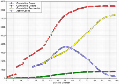
Graph 1
Example introductory paragraph:
The first graph shows the global cumulative number of SARS cases over a period of 105 days. Cumulative death and recovery numbers are also given. The second graph shows the daily numbers of new SARS cases from January to April 2003, around the same time period as graph 1.
- The main section should be a more detailed description of the information given. If there are 2 graphs, compare or contrast where appropriate. You don't need to include every numerical detail but all major trends should be covered. You need to decide on the clearest way to present material: line graphs often present data chronologically; bar graphs and pie charts vary depending on data. What is most important?
- Use a variety of words and phrases and sentence structures: see language tips below.
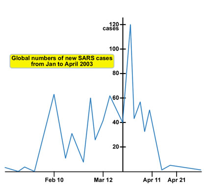
Graph 2
Example paragraph:
Graph 1 shows that there were around 8,500 SARS cases in total in 2002-3. Slightly less than 1,000 proved fatal. Active cases peaked at day 56, when 3,750 people were affected, before declining. This (blue) line correlates with data given in graph 2, showing daily new SARS cases. Day 56 was around late March, when new cases increased very sharply and peaked before declining equally dramatically.
The second graph shows the fluctuation of daily new SARS cases. Numbers varied, starting low in January but rising to 60 cases per day in mid-February and again in mid-March, falling to below 20 in between. Cases peaked in late March, with the maximum number totalling 120 in one day. Numbers then fell equally sharply, with 2 slight fluctuations, to just 1 or 2 cases by the end of April.
- The conclusion can be a sentence or two to summarise findings, emphasise the main point deduced from the graph(s) or point out a final piece of relevant information or observation.
Example conclusion:
To conclude, new cases fluctuated globally during the period, but peaked in March. After that cases declined dramatically and the recovery rate rose steadily from then until the end of the threat.
Language Tips for Task 1
1. Describing Trends
a) Verbs and nouns:
Trends are movements and can basically go up, down or stay the same.
| Upward Trend | ||
| Verbs | Verbs and Nouns | Nouns |
| augment expand go up grow soar swell |
boom climb increase peak rise supplement |
growth upward trend |
| Downward Trend | ||
| Verbs | Verbs and Nouns | Nouns |
| go down shrink subside |
decline decrease dip drop fall nosedive slump |
trough |
Example sentences:
Sales expanded during the first decade of the twenty first century.
There was a growth in sales in the first decade of the twenty first century.
b) Adjectives and adverbs:
These describe the degree or speed of the trend or movement.
| Adjectives | |
| Degree of trend / movement | Speed of trend / movement |
| dramatic large moderate sharp significant small steep strong substantial |
gradual quick rapid slow steady sudden |
| Adverbs | |
| Degree of trend / movement | Speed of trend / movement |
| dramatically sharply steeply substantially moderately strongly significantly |
gradually quickly rapidly slowly steadily suddenly |
Example sentences:
Sales expanded sharply during the first decade of the twenty first century.
There was a sharp growth in sales in the first decade of the twenty first century.
Further resources
For more practice in describing trends, with example sentences, paragraphs, reports and interactive exercises, try these sites. Remember, the more examples you see and practice you get, the more confident you will be with your own writing
http://elc.polyu.edu.hk/cill/exercises/trends.aspx
http://elc.polyu.edu.hk/cill/eap/trendtitles.aspx
2. Using Verb Tenses
What verb tense would you use to
- Define the parameters of the graph?
- Describe information gathered over a previous period of time?
Use the present tense for the first sentence defining the graph(s). Use the past tense to discuss findings from previous years. If no date is given, presume data is current and use present tenses.
The present perfect is used for unfinished actions and can contrast with the simple past (finished actions). The present continuous (progressive) is used to describe things in the process of happening, and the future with "will" is commonly used for predictions.
If you are unsure about verb tense usage, click here:
http://elc.polyu.edu.hk/CILL/exercises/choosing-verbs.aspx
3. Comparatives and superlatives
Comparatives contrast 2 things.
Generally speaking, short words (1 syllable, 2 syllables ending in 'y') take the suffix 'er'. e.g: higher/ faster/ lower/ smaller/ prettier/ bouncier than...
Longer words (2-3 + syllables) are preceded by 'more'. e.g: More awful/ drastic/ dramatic/ interesting/ unstable/ impressive than...
Superlatives describe the most extreme of 3 or more things.
Short words take the suffix 'est' preceded by 'the'. e.g: The highest/ lowest/ brightest/ smallest...
Longer words are preceded by 'the most'. e.g: The most dramatic/ dynamic/ unstable/ fluctuating...
If adding a suffix would change the pronunciation of a word, the middle consonant is doubled. e.g: bigger/ redder/ hottest...
For more explanation and practice, click here:
http://web2.uvcs.uvic.ca/elc/studyzone/330/grammar/regcom.htm
4. Prepositions of position, expressing proportion
When comparing or contrasting graphs or data, prepositions are useful e.g: above, below, around, about, (nearly/not) as ... as.
Fractions or percentages can also express comparative proportions e.g: a half/ a third/ a quarter/ 60%/ around 20% of...
To learn and practise more with prepositions, click below.
http://elc.polyu.edu.hk/cill/eap/2004/u2/pg34preps.aspx
http://elc.polyu.edu.hk/cill/eiw/approximation.aspx